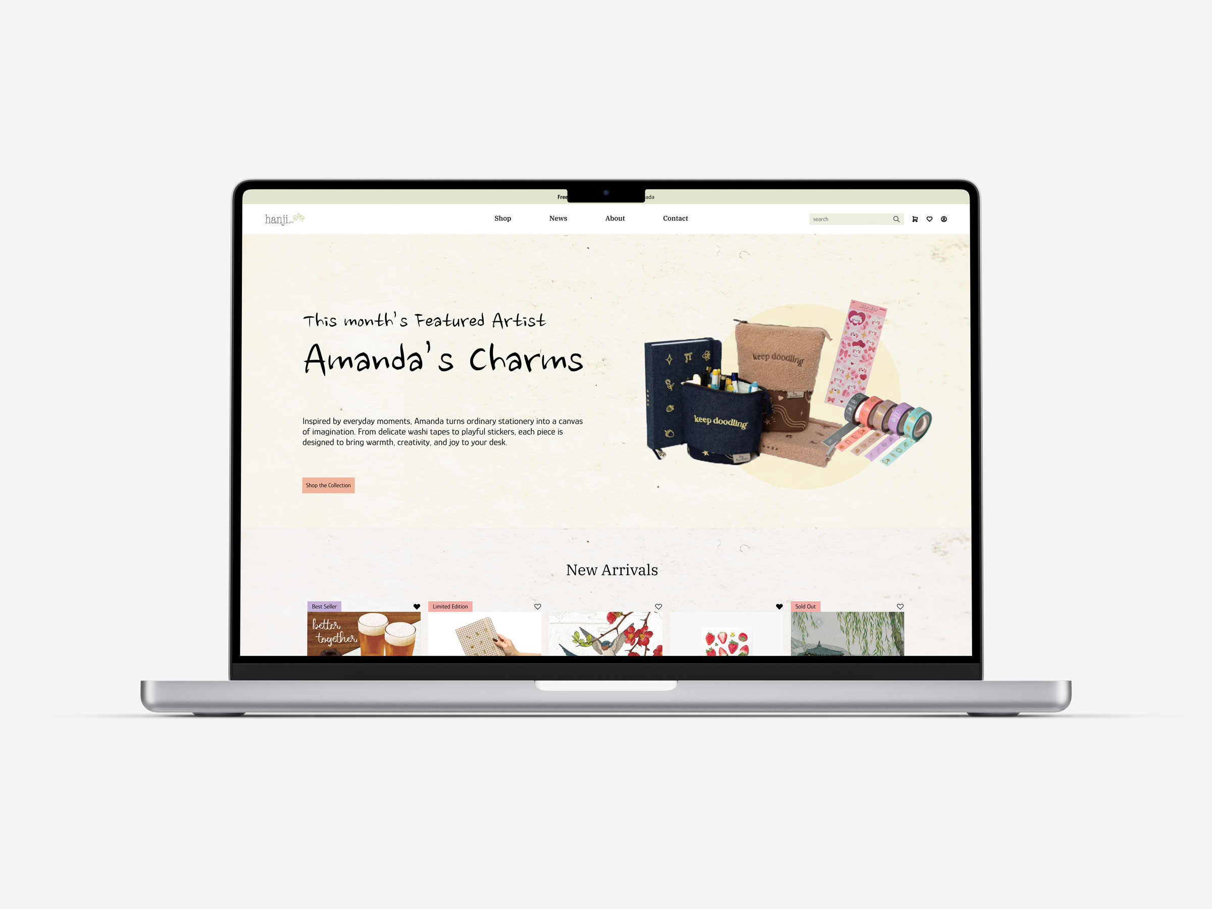
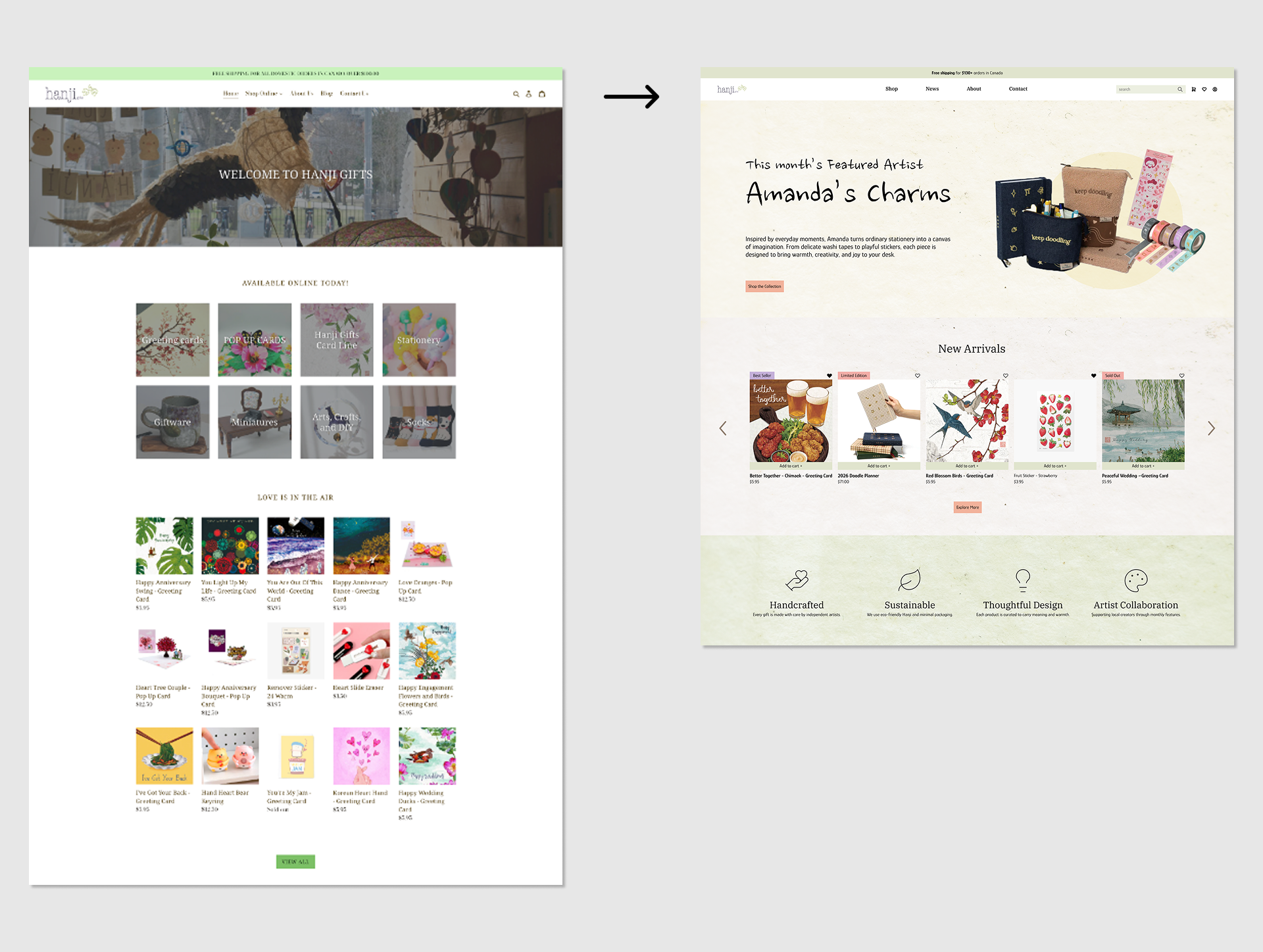
Hero Section Rationale
The hero section was restructured to prioritize discovery and brand storytelling over immediate product listing. Featuring an artist-led collection helps users quickly understand the value of Hanji while encouraging exploration in a calmer, more intentional way.
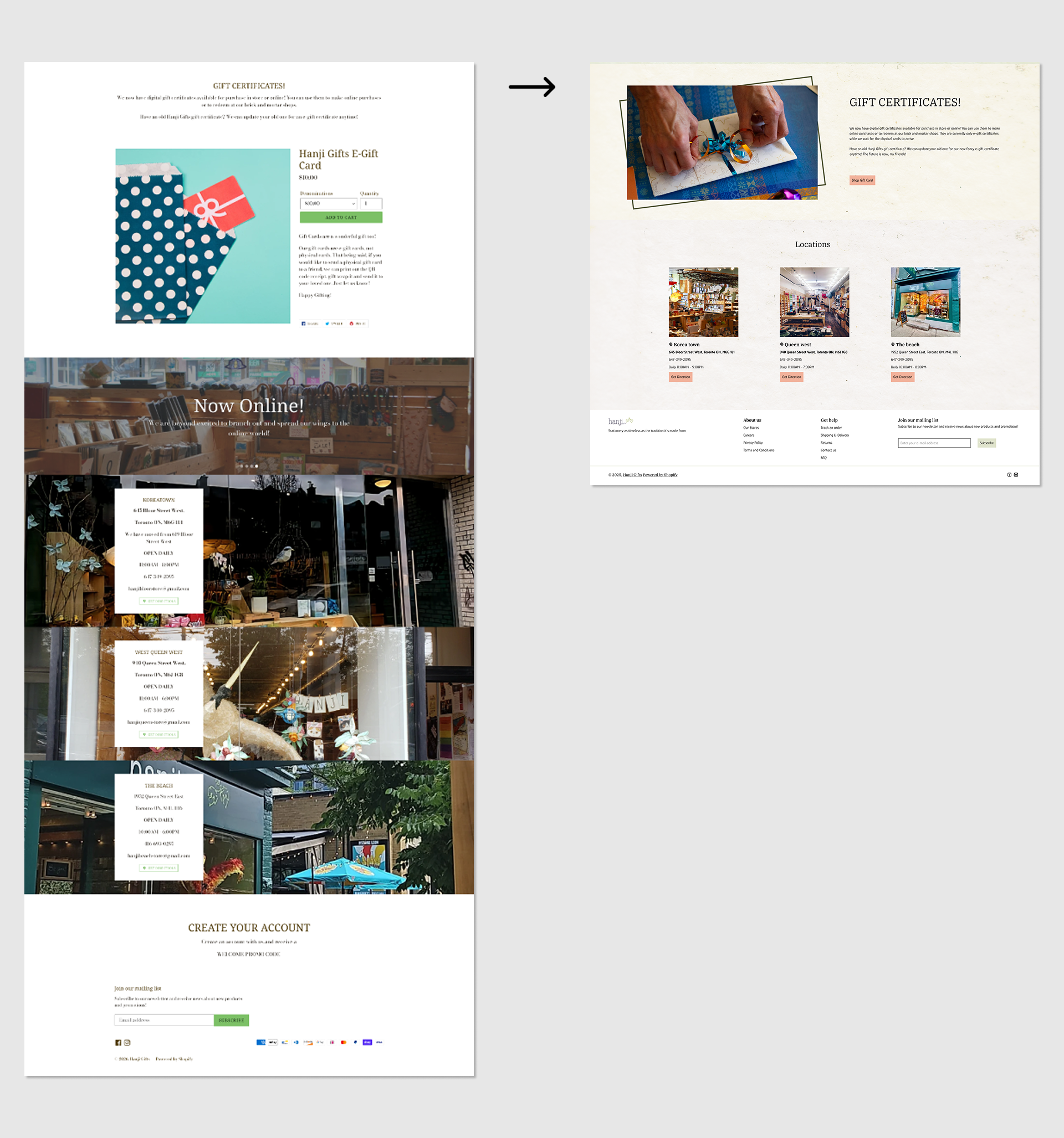
Footer & Supporting Sections Rationale
The footer and supporting sections were restructured to improve usability and clarity. Practical information such as gift certificates and store locations is clearly organized, helping users navigate effortlessly while reinforcing trust and accessibility.
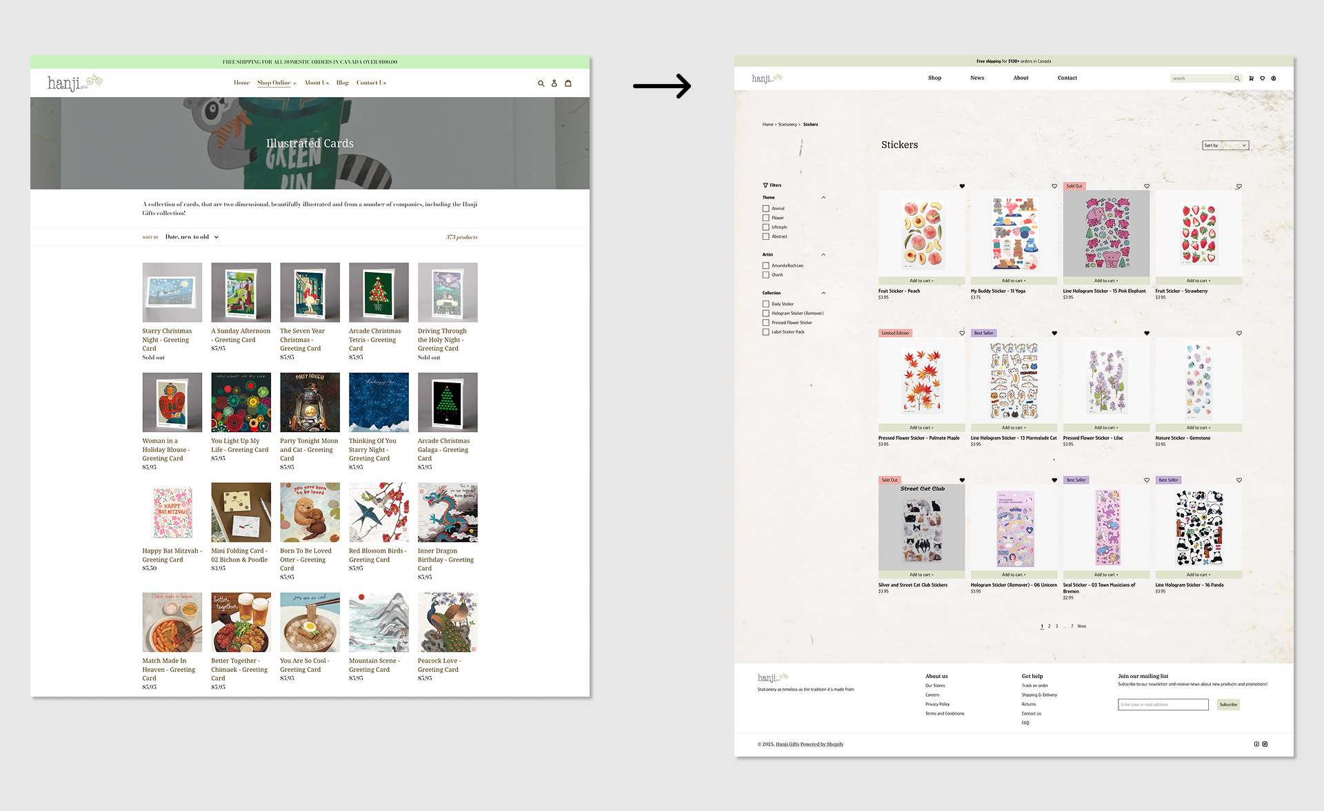
Category Page Rationale
The category page focuses on clearer filtering and visual hierarchy, making it easier for users to browse collections and discover products without feeling overwhelmed.
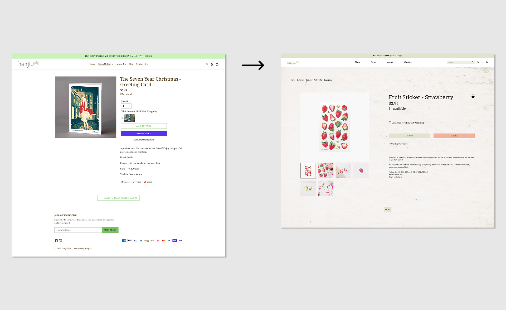
Product Page Rationale
The product page emphasizes clarity and ease of purchase by simplifying layout, prioritizing imagery, and reducing unnecessary interaction steps.
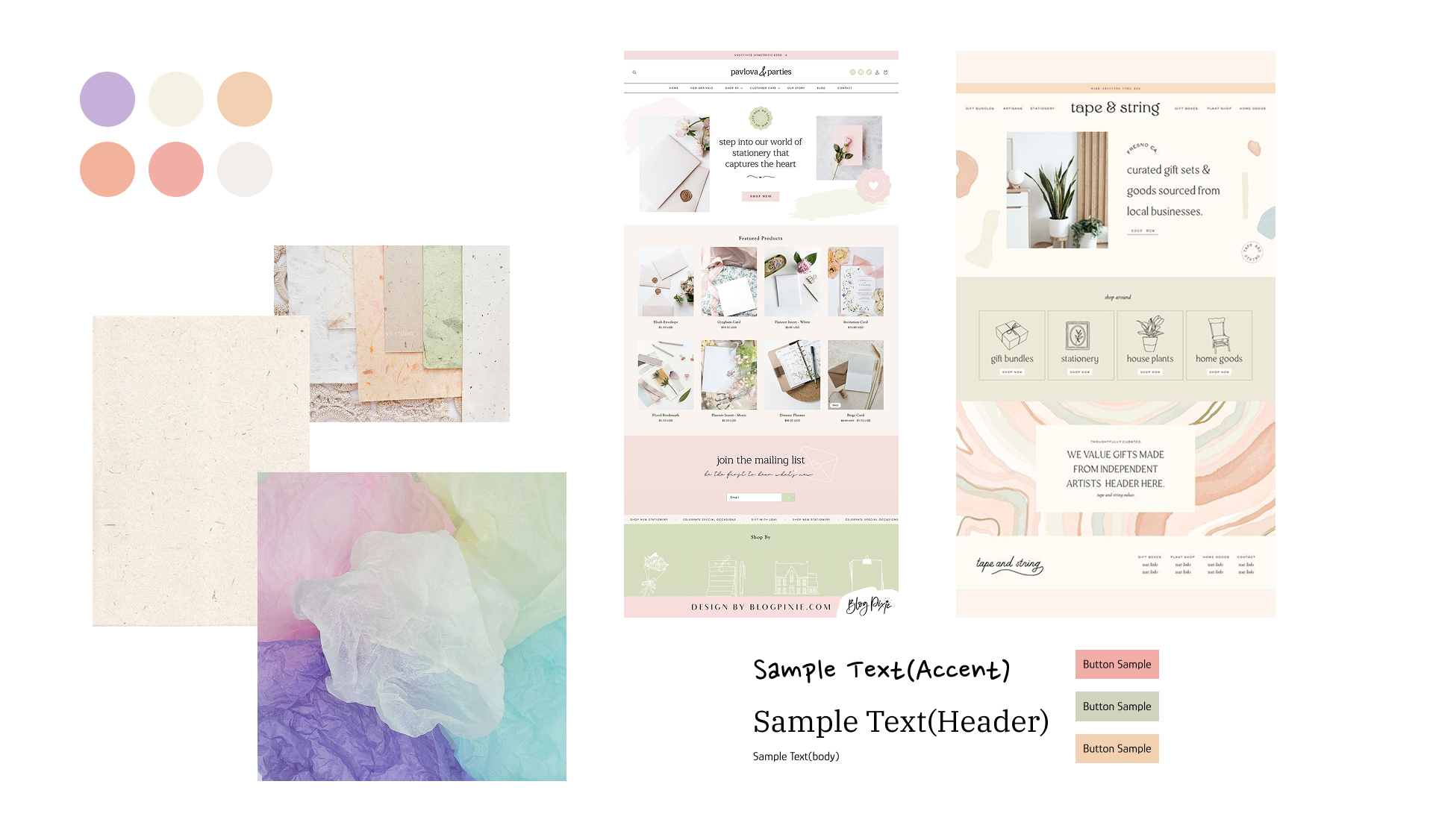
Moodboard
The moodboard explores a calm, soft, and tactile visual direction inspired by traditional Hanji textures. Muted pastel tones, organic paper surfaces, and gentle typography references were selected to balance warmth, craftsmanship, and a modern digital experience.